一THE ARCHIVE

Eight cases

08Cases in depth 50+Projects delivered 4Years 5Markets — FR · IT · RO · MD · CY
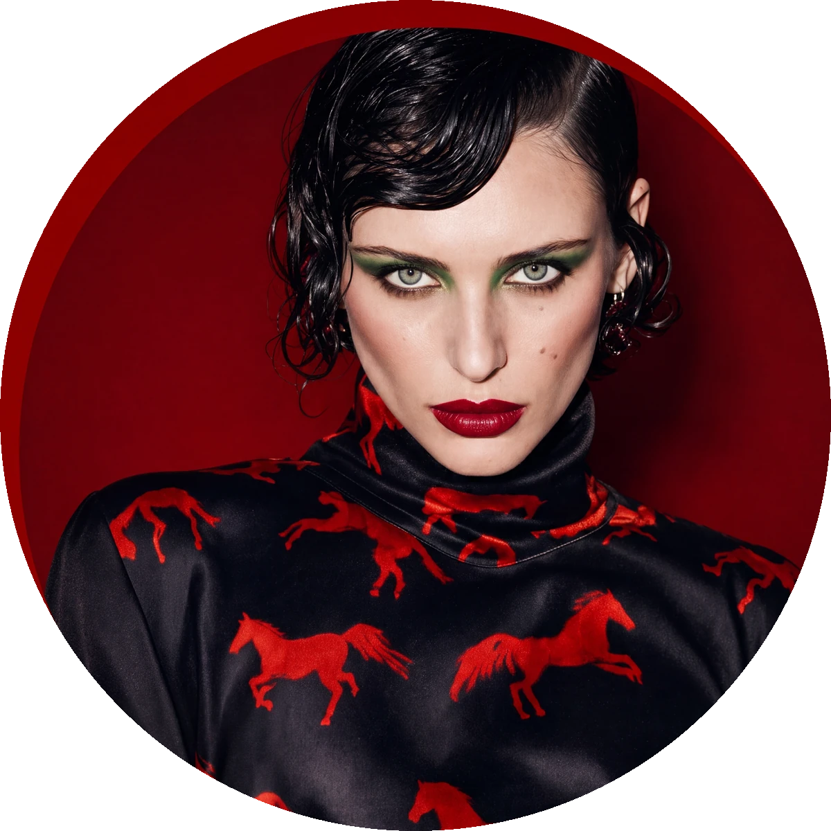
Fire-Horse campaign — the portrait, framed in red
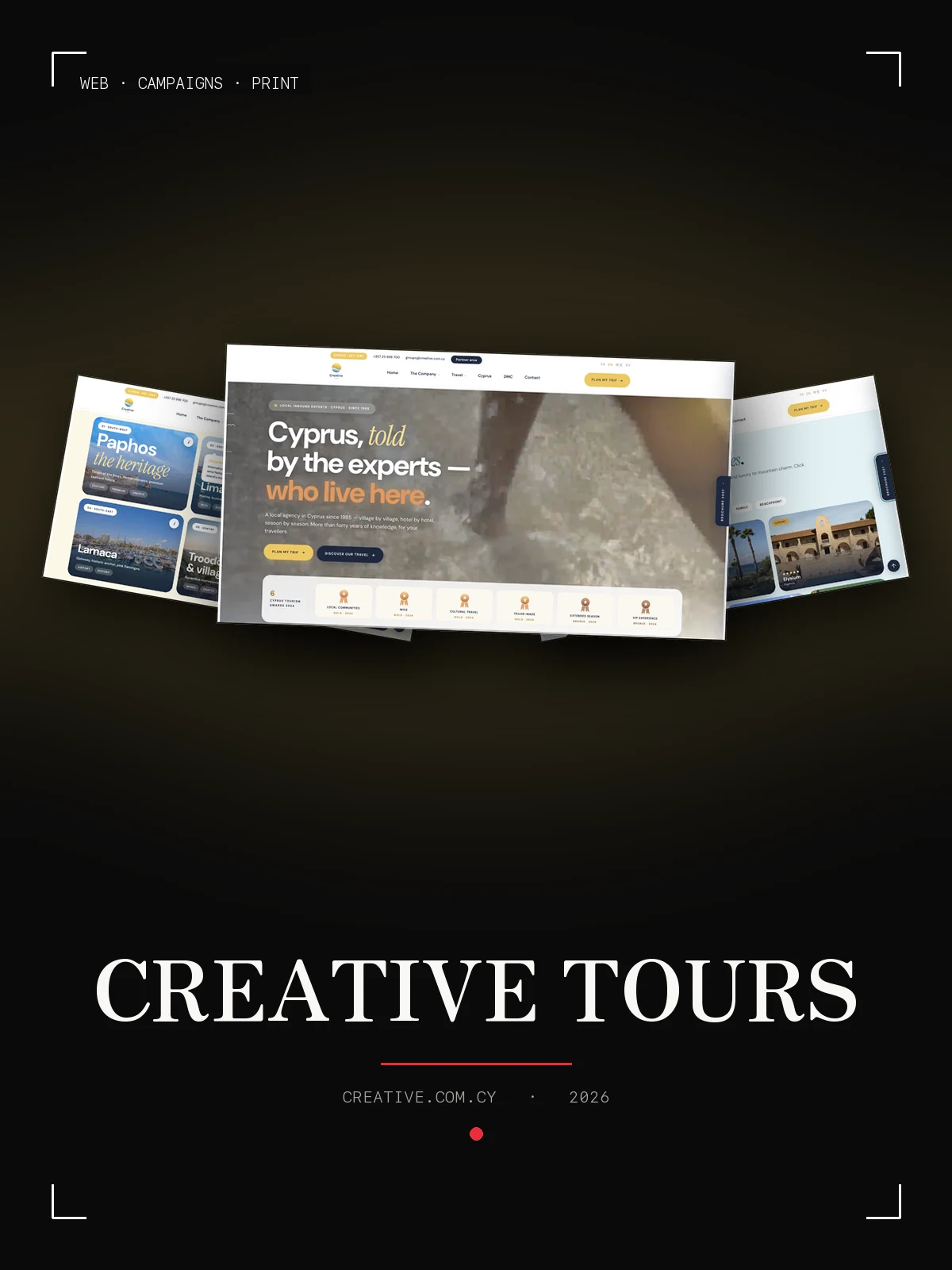
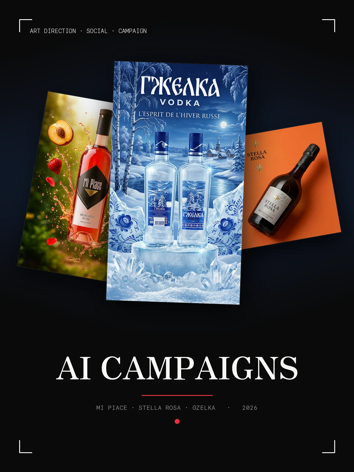
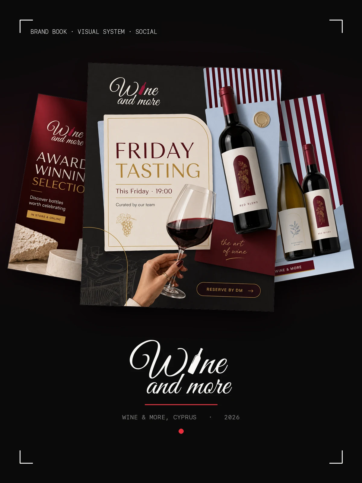
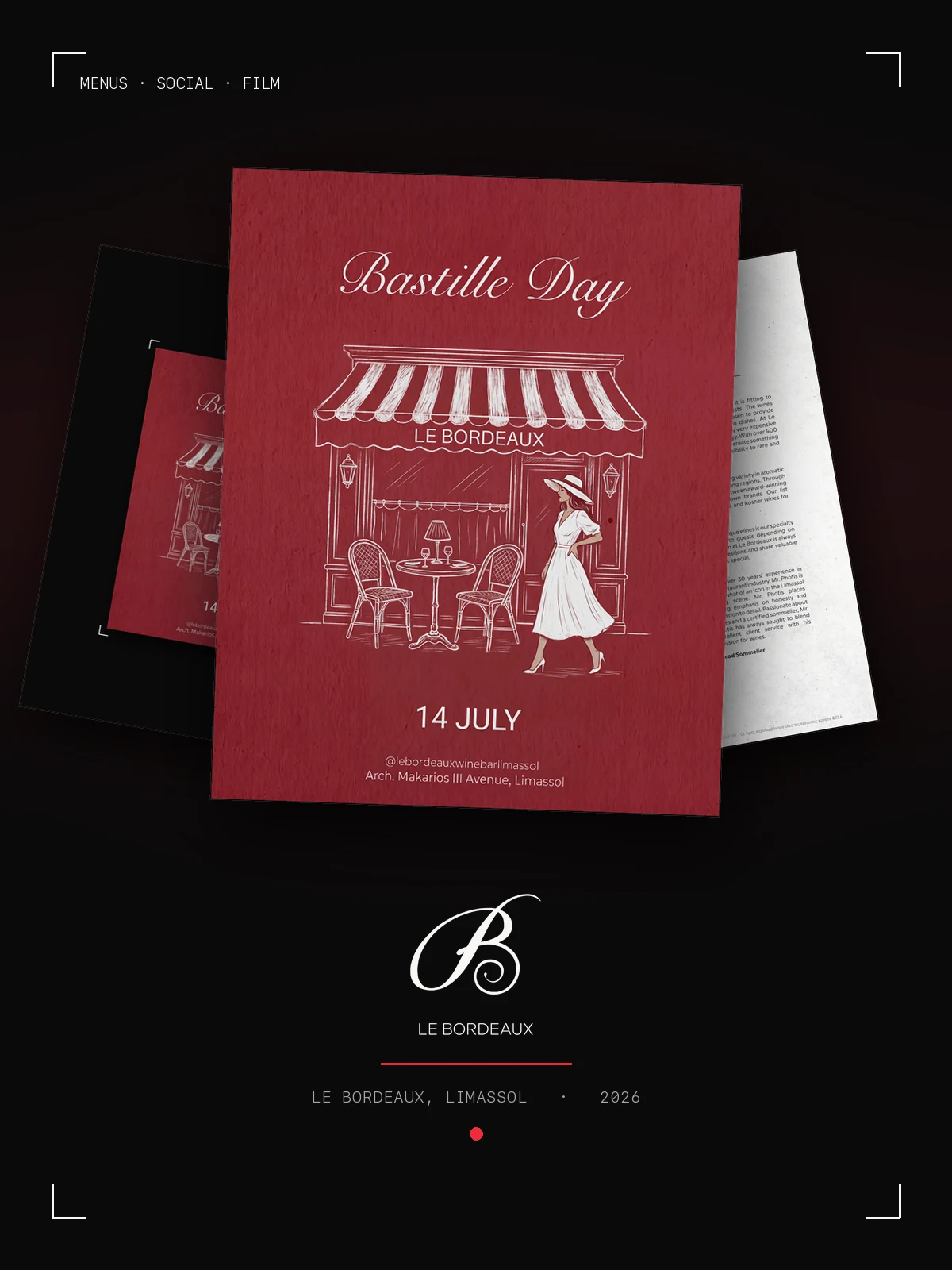
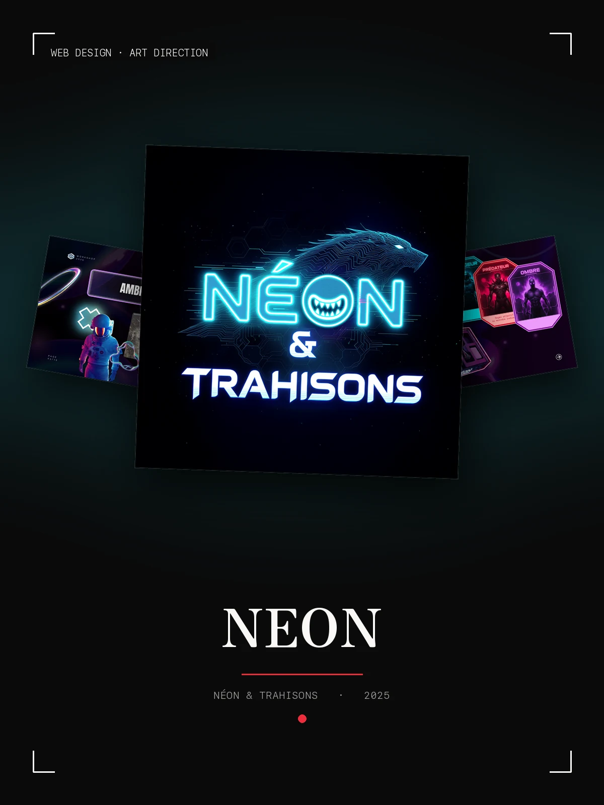
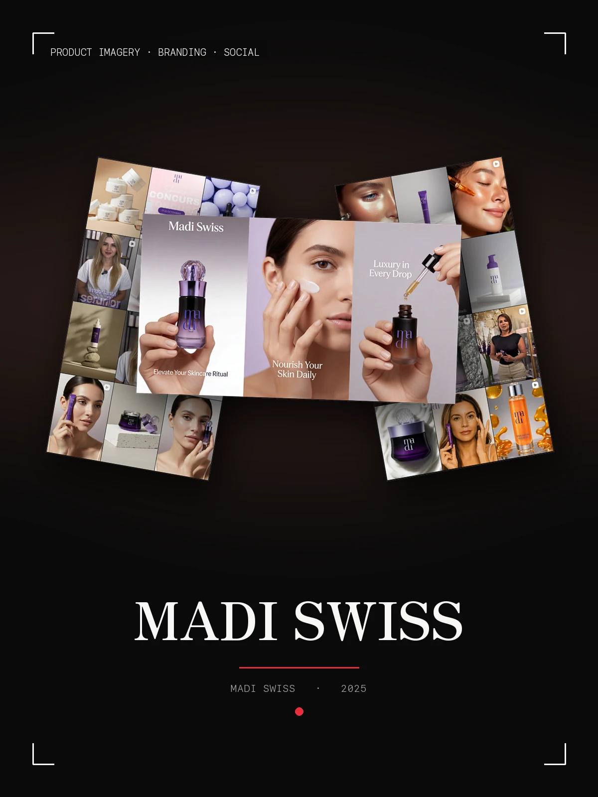
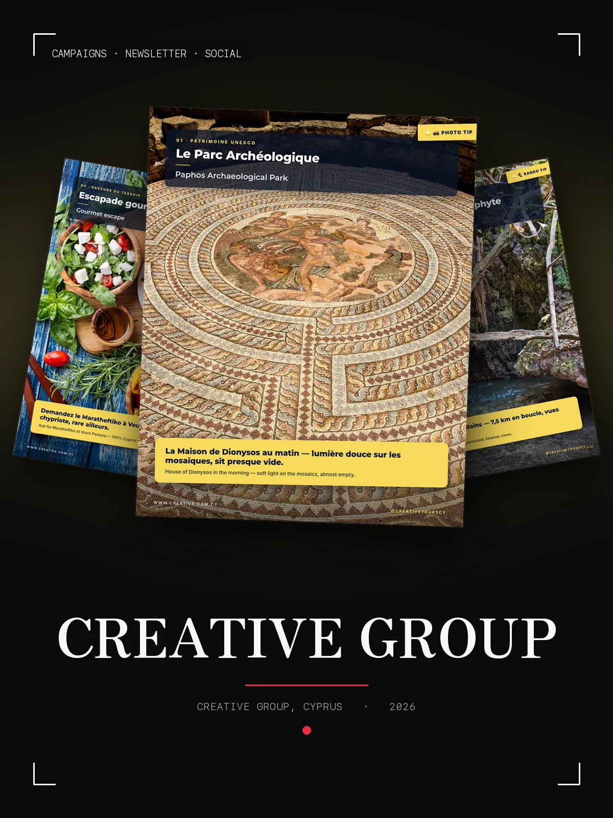
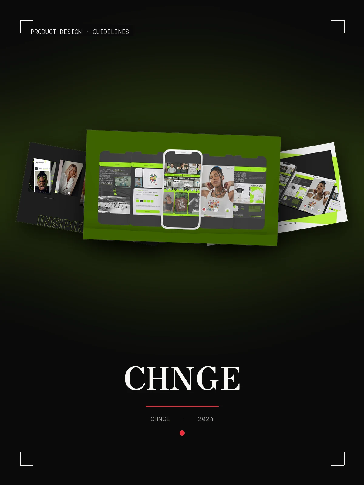
Wine & More — case coverSocial · Post templates · Art directionWine & More01 Le Bordeaux — case coverMenus · Social · FilmLe Bordeaux02 Creative Tours — case coverWeb · Campaigns · PrintCreative Tours03 Neon — case coverWeb design · Art directionNeon04 AI Campaigns — case coverArt direction · Social · CampaignAI Campaigns05 MADI Swiss — case coverProduct imagery · Branding · SocialMADI Swiss06 Creative Group — case coverCampaigns · Newsletter · SocialCreative Group07 CHNGE — case coverProduct design · GuidelinesCHNGE08
二ALSO IN THE ARCHIVE

Eight more here. The rest of the fifty-plus, across wine, beauty, hospitality and web, shown on request or in the deck.

三What owners ask

Before you write

Eight questions every owner asks before the first email, answered the way they are answered across a table. Open one.

The name, the menu as it stands, a few photos of the room and the person who signs off. The first two weeks settle the identity; menus, print and the opening feed follow, in that order. One conversation produces the plan, with dates your other contractors can be held to.

Because a system of five menus and a single wine card are not the same job. You describe the place; the quote comes back as one fixed figure with every item it buys, before anything starts. After that there are no surprises by the hour.

The plan is built backwards from the press date: proofs, approvals, the day your answer is due. Printers do not wait, so nothing is left to the last week. The only thing that moves a deadline is a late reply, and you see those dates before we start.

That is the normal brief in Cyprus, and this site is the proof: four languages, one typographic system, each version written rather than machine-translated. Menus get the same treatment, in two alphabets where needed, and the booking path stays the shortest thing on the page.

There is no lottery of ten logos. You see one considered direction, with the reasoning, built on what you told me about the place and the guests. Changes are part of the scope and written into it. If the direction itself misses, we go back to the brief before anyone draws again.

No. Keep the mark; it is what your clients recognise. What usually fails is everything around it: the price list, the booking confirmation, the feed, the window. Those are rebuilt to one standard, and the logo looks better for it. Start with a single piece if you want to see it work first.

Everything, in files you can use: print-ready menus and labels, the web files, the source files of the identity, the fonts with the licences you need, and a short guide so the next printer or photographer works to the same standard. Registering the name and the mark is your side of the paperwork; the files are ready for it.

Keep the niece. Canva is right for the Tuesday story, and she gets templates built for exactly that. A studio is for the things you print once and live with for years: the name on the window, the label on the shelf, the menu in the hand, the site that takes the booking. Those decide whether the Tuesday story has anything to sell.